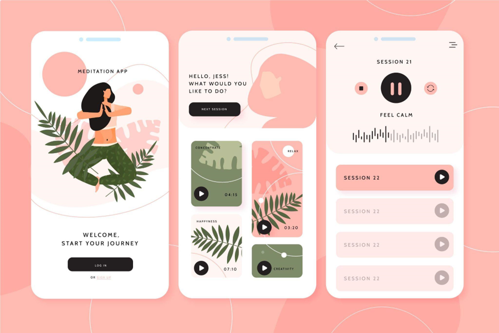
Imagine opening an app and there! You are bombarded with buttons, icons, and more text than a library. It feels overwhelming, right? That is why minimalism and aesthetics are important in the world of UI UX design. Minimalism and aesthetics are not just design trends but essential principles in UI/UX design.
Let us ditch the clutter and explore how these two works together to create amazing user experiences.
Understanding Minimalism in UI/UX Design
Minimalism revolves around the mantra – less is more. Think of minimalism as a decluttering expert. It removes unnecessary elements and leaves only the essentials. This keeps things clean, simple, and easy to use.
Here’s how Minimalism helps in UI/UX Design:
-
- Less confusion, more focus: No more visual noise! Users find what they need faster.
-
- Faster loading times: Less weight means speedier access, which is especially important for mobile users.
-
- Happier users: Who likes frustration? A smooth, streamlined experience makes users feel good, and happy users come back for more.
Take the website of Apple as an example. Their minimalist approach focuses on clean lines, ample white space, and simple navigation.
This allows users to focus on the products and their features effortlessly.
Embracing Aesthetics in UI/UX Design
Minimalism alone is not enough. This is where aesthetics come in! They add an emotional touch. Aesthetics plays a crucial role in UI/UX design. Eye-catching visuals, beautiful colour schemes, and appealing typography contribute to the overall aesthetic appeal.
Here’s how Aesthetics helps in UI/UX Design:
-
- Brand personality: Cool, playful, or sophisticated? Aesthetics help you communicate your brand’s unique voice.
-
- Emotional impact: Colors, fonts, and images evoke feelings. Choose wisely to create the desired vibe.
-
- Engagement boost: An attractive interface is inviting, like a delicious-looking cake that makes you want to take a bite (or click!).
The Airbnb website is a good example of aesthetics in UI/UX design. It has a visually appealing interface that features high-quality images. The elegant typography and vibrant colors attract users to explore listings and book accommodations.
Blending Minimalism and Aesthetics
Now, imagine combining these two. Minimalism and aesthetics combine to create outstanding designs. They are visually pleasing and functionally efficient. This is the sweet spot for any UI UX designer. Remember, it is not about removing everything but about choosing wisely and placing things purposefully.
Google’s Material Design is a prime example of the combination between minimalism and aesthetics. It adds a clean and minimalist interface that uses subtle visual elements. This includes shadows, depth, and motion. This creates a visually engaging and intuitive user experience across various devices and platforms.
Tips for best Design with Minimalism & Aesthetics
-
- Start with the user: What are their needs and goals? Design around them, not just trends.
-
- Whitespace is your friend: It is not just empty space. It is breathing room for your elements to shine.
-
- Clear hierarchy is key: Guide users like breadcrumbs. Make it easy to find what they need.
-
- Quality over quantity: Choose high-quality elements that add value, not clutter.
The Power of MITSDE’s Advanced UI UX Certification
Want to master this art of minimalism and aesthetics? MIT-SDE’s Advanced UX UI Design Certification course is the answer. You will learn from industry experts, get hands-on with real-world projects, and discover:
-
- Advanced design principles: Dive deep into user research, information architecture, and interaction design.
-
- The latest UI UX trends: Stay ahead of the curve with cutting-edge design techniques.
-
- Portfolio-building projects: Showcase your skills to potential employers with impressive projects.
-
- Career guidance: Get expert advice on landing your dream UI UX job.
Now, don’t settle for average interfaces. Join MITSDE’s Top UX UI Design Course and craft experiences that are both beautiful and effortless. Because in the world of UI UX design, less is truly more, and beautiful is simply unforgettable.


