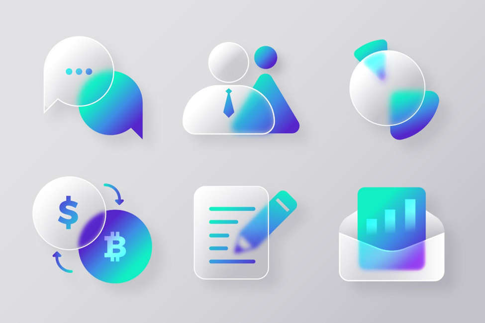
User Interface (UI) design is like the clothes your favourite app wears. It is what makes it look good and easy to use. Two trendy styles in UI design right now are Neumorphism and Glassmorphism. Let’s break them down and see what they’re all about!
Neumorphism: A Soft and Subtle Approach
Neumorphism is like soft lighting in a cosy room. It gives UI elements a soft, subtle, and almost three-dimensional look. Imagine buttons that look like they are slightly raised or depressed as if they are made of soft clay. Shadows play a big role here. They gently outline elements to give them depth.
The colour palette in Neumorphism tends to be muted and earthy, like warm browns or soft greys. This adds to the cosy, organic feel.
Think of it like this: when light hits a real object, it creates shadows and highlights. Neumorphism mimics this effect, giving digital elements a physical presence.
The goal of Neumorphism is to make UI elements feel tactile like you can touch and interact with them. It is a departure from the flat design trend of the past, adding a layer of realism without going overboard.
Why use Neumorphism?
- It is fresh and eye-catching! The 3D effect grabs attention and adds depth to interfaces.
- It can highlight important elements. By making buttons or menus “pop,” Neumorphism guides users where to look.
- It feels clean and modern. The soft shadows and minimal colours keep the design sleek.
Challenges:
-
- Overuse. Too many 3D elements can clutter the interface and make it confusing.
- Accessibility concerns. People with visual impairments might struggle to see neumorphic elements due to subtle contrast.
Glassmorphism: Sleek and Transparent
Glassmorphism, on the other hand, is like looking through a sleek glass surface. It is all about transparency and depth. It gives UI elements a glossy, glass-like appearance. Imagine buttons that look like they are made of transparent glass, with light and shadow dancing underneath.
This style often incorporates frosted glass effects, adding a layer of blur to the background to enhance the illusion of depth.
Colours in Glassmorphism are often vibrant and bold. This adds to the futuristic, high-tech vibe of the design.
Glassmorphism is a departure from the skeuomorphic design trend of the past, where elements were made to look like their real-world counterparts. Instead, Glassmorphism embraces the digital nature of UI design, using transparency and light to create a visually striking experience.
Why use Glassmorphism?
-
- It creates a modern, airy feel. The transparency makes the interface lighter and more spacious.
-
- It helps organise content. By layering elements, Glassmorphism can guide users’ eyes to different sections.
-
- It can add a touch of elegance. The subtle blur effect creates a dreamy, ethereal vibe\
Challenges:
-
- Too much transparency can be confusing. Users might not understand what is clickable and what is background.
-
- Performance issues. Overusing transparency can slow down websites and apps.
Choosing the Right Style for Your Project
So, which style should you choose for your next UI project? It depends on the mood and tone you want to convey. If you are going for a cosy, organic feel, Neumorphism might be the way to go. It is perfect for apps that want to feel welcoming and familiar.
On the other hand, if you are aiming for a sleek, futuristic vibe, Glassmorphism might be more your style. It is great for apps that want to feel cutting-edge and innovative.
So, which trend is better?
Neither! Both Neumorphism and Glass morphism have their pros and cons. The best choice depends on your specific design goals and target audience. Many designers like to mix and match elements from both Neumorphism and Glassmorphism to create a unique look that is all their own.
Here are some tips for using these trends effectively:
-
- Use them sparingly. A few well-placed elements are more impactful than a cluttered mess.
-
- Consider accessibility. Ensure enough contrast and clarity for everyone to understand the interface.
-
- Match the brand style. Choose a trend that complements your overall design aesthetic.
In the world of UI design, Neumorphism and Glassmorphism are two exciting styles that are taking the industry by storm. Mastering these skills can open doors to exciting careers, but where do you start?
MIT School of Distance Education offers the Best UI UX Design Course in Pune. This online UI/UX certification is designed by industry experts. It is packed with the latest knowledge and delivered in a convenient, flexible format. MITSDE’s UI Certification course in Pune is more than just a piece of paper. It is a passport to exciting career opportunities.