
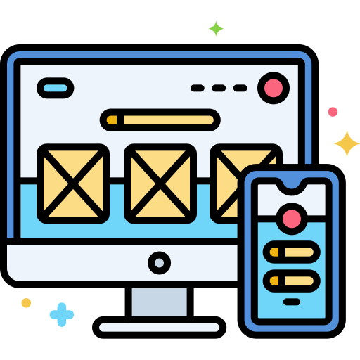
Responsive web design is all about creating websites that work seamlessly across all devices—phones, tablets, laptops, and desktops. This approach ensures your website looks great and functions smoothly, no matter how users access it.
In this article, we’ll explore what responsive UI/UX design is, why it’s important, and how you can design websites that automatically adapt to various screen sizes. Whether you’re a beginner or an experienced designer looking to enhance your skills, understanding responsive UI/UX design is essential for building modern, user-friendly websites.
What is Responsive UI/UX Design?
Responsive UI/UX design refers to an approach where the user interface (UI) and user experience (UX) are developed to adjust automatically based on the user’s device or screen size. The design elements—such as text, images, and layout—shrink, expand, or rearrange to suit different viewing environments. This ensures better usability and accessibility across all platforms.
A responsive website often uses a single layout structure enhanced with HTML5, CSS3, and JavaScript frameworks. Elements may be shown or hidden based on screen resolution, or become accessible through gestures like dropdowns or swipe actions.
Importance of Responsive UI/UX Design
As UI stands for User Interface and UX stands for User Experience, the core focus is on the user. Here’s why responsive design is essential:
- Reach a larger audience: Most users access the internet via mobile devices. A mobile-optimized design improves accessibility and engagement.
- Save development time: Instead of creating separate versions for each device, responsive design requires only one adaptable layout.
- Boost SEO performance: Google and other search engines favor mobile-friendly websites, giving them better rankings.
- Maintain design consistency: A unified design system across devices reinforces brand identity and user trust.
How to Create a Responsive UI/UX Design
Follow these essential steps to create a responsive design:
- Design for responsive screen sizes: Use flexible grid layouts and breakpoints in CSS.
- Build a responsive image gallery using HTML/CSS: Make images scale appropriately and maintain aspect ratios.
- Consider earning a responsive web design certification: Stay updated with best practices and recognized credentials.
- Learn how to make websites responsive using CSS: Leverage media queries, flexbox, and grid layout systems.
- Implement responsive tables: Design tables that scroll horizontally or collapse on smaller screens.
- Use Bootstrap datatables for responsive layouts: Utilize Bootstrap’s built-in responsive components.
- Explore real-world responsive web design examples with source code: Practice reverse-engineering great designs.
- Try React Native responsive screen tools: For mobile apps, use libraries like react-native-responsive-screen.
Benefits of Responsive UI/UX Design
- Reduces Bounce Rate: A well-optimized, accessible website keeps users engaged.
- Mobile Friendly: Layouts adjust dynamically for mobiles and tablets.
- Increases Traffic: Better user experience leads to higher retention and shares.
- Enhanced User Experience: Seamless navigation and readability across all devices improve customer satisfaction.
- Improves SEO Rankings: Responsive design aligns with search engine algorithms and enhances discoverability.
Best Practices for Responsive Web Design
- Mobile-First Approach: Start designing for smaller screens first, then scale up for larger devices.
- Accessible Content: Use semantic HTML, keyboard-friendly navigation, and alt text for inclusive design.
- Responsive Media: Ensure images, videos, and other media scale to fit the screen.
- Optimize for Landscape Orientation: Don’t ignore horizontal viewports, especially on tablets and phones.
- Stay Updated: Follow the latest trends and technology in responsive UI/UX design.
Learn UI/UX the Right Way with MITSDE
To master all the techniques discussed above, consider enrolling in an industry-relevant program like the Advanced Certificate in UI/UX by MITSDE.
MITSDE offers an online UI UX designer course in Mumbai and UI UX design course with placement in Mumbai, as well as UI UX design course in Mumbai and UI/UX training in Pune. Their UI/UX design classes in Pune and Mumbai are crafted to provide hands-on experience and career-ready skills.
About the Course
UI/UX Design focuses on creating meaningful, user-centered experiences by combining usability, aesthetics, and performance.
This course will help you:
- Understand the Design Thinking process
- Conduct effective User Research
- Learn advanced Interface Design principles
- Explore future trends in UI/UX
You’ll also gain mentorship from industry experts and access a support team to help you through your learning journey.
Final Thoughts
Designing fully responsive UI/UX is a must-have skill in today’s digital-first world. Whether you self-learn or enroll in a structured program, staying ahead with the latest techniques is crucial.